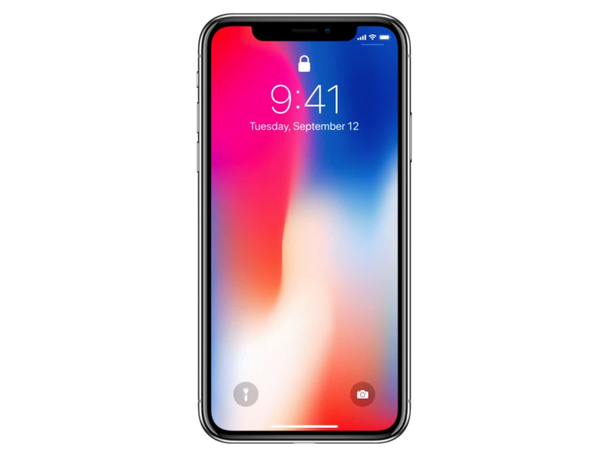
Android P is still in super-duper developer-only beta mode, but you only need to look at an iPhone X to see what your Pixel phone will look like once the new models land later this summer.
Okay, I kid, but there’s no denying that Google has taken at least some inspiration from Apple’s thousand-dollar flagship phone. First there’s the support for “cutout” displays, better known as The Notch. One of Android P’s premier features will be proper support for cameras that jut into the screen, so apps, videos, and status bars can display properly.
That was to be expected. After Essential Phone kicked off the notched aesthetic (even before the iPhone X landed), more than a few Android phones have jumped on the bandwagon, and it’s clear that many new phones will adopt the look going forward.
 Google
This screenshot from a Google blog post shows a new navigation bar, with a pill-shaped home button and no recents button. The pic has since been cropped to remove the navigation bar.
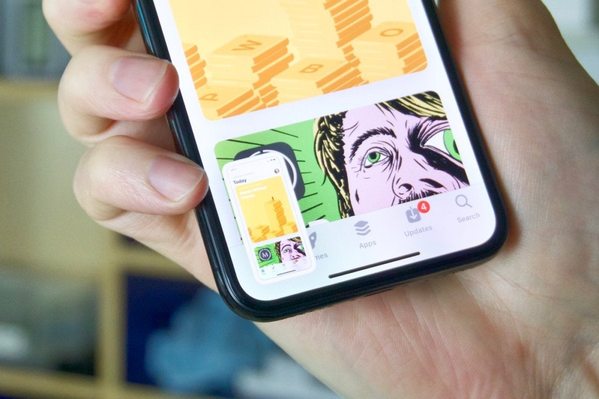
But a new rumor takes the iPhone X influence even further. In a since-edited screenshot in blog post about DNS security improvements in Android P, Google posted an image of what seems to be a navigation bar rather than a button at the bottom of a Pixel screen, with a back arrow next to an elongated strip similar to Apple’s home indicator. There isn’t much to go on beyond that, but Stephen Hall at 9to5Google confirms that Google is indeed developing a new iPhone X-style gesture-based navigation bar design complete with a new pill-shaped button and refined layout that dumps the long-standing square “recents” button for a swipe-up gesture.
This move is decidedly less expected. When Apple added its virtual navigation bar as part of the iPhone X’s iOS makeover, it was because it lost the home button, which had been affixed to the space below the screen since the beginning. A new navigation method was necessary since the old one was gone, and Apple clearly put a lot of thought into developing a system that was new yet familiar.
But most Android phones lost their home buttons years ago, relying instead on a virtual array of three buttons—back, home, and recents—that created a sense of unity across all Android phones. Even handsets with a physical home button were still flanked by back and recent keys. It was one of the few constants in Android, and I always assumed Google didn’t mess with it because introducing a new method would make things too difficult for its handset partners. The Nexus and Pixel phones simply followed suit.
I never had an problem with Android’s navigation, but after using the iPhone X, it’s clear that there’s a better way. Apple’s gesture-based navigation is simple, intuitive, and delightful, and it makes Android phones seem stale by comparison. Implementing a similar method with the Pixel 3 will make certainly Google’s phone easier to navigate and feel more modern, but I can’t help but wonder why Google is implement this change now rather than a year ago when the Pixel launched. And the only answer I can come up with is that Google has simply lost the ability to innovate.
Stalled innovation
If you look at the last few Android releases, you’ll find few, if any unique features. Nougat’s multi window and Oreo’s picture in picture were already popular features on Samsung phones. Rich replies within notifications first appeared in iOS 8. And as we know, Android P’s notch support was refined on the iPhone X.
 Jason Cross/IDG
The next Pixel phone will reportedly have an iPhone X-like home bar rather than a virtual button.
The same goes for the Pixel. While it’s hard to deny that Google’s handset offers the best Android experience money can buy, it doesn’t necessarily anything new to the table. The Pixel 2’s premier feature, Active Edge, which lets you squeeze the sides of the phone to launch Google Assistant, debuted on the HTC U11 months before. The design is fine but nothing that you haven’t seen on the LG V30 or OnePlus 5T. The Pixel still doesn’t have SD card support or wireless charging. And even Google’s decision to remove the headphone jack was decidedly less bold after Apple did it first.
That’s a shame. There was a time when Google was just as revolutionary and influential as Apple in the mobile space. The foundation of Android may have been inspired by the original iPhone, but Google took it to places Apple didn’t, with smart gestures, tremendous customization, and deep integration with Google’s apps and services. But as Android has gotten more dominant, Google has rested on its laurels, and now it’s seems as though it’s taken to flat-out copying the latest direction from Apple.
 Daniel Masaoka
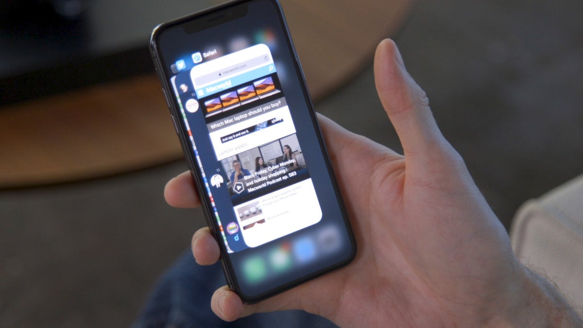
Android P’s recent apps screen might look a whole lot like the one on iPhone X.
Based on the 9to5Google report, it doesn’t seem like Google is bringing anything new with Android P’s new navigation. Like on the iPhone X, you’ll swipe from the bottom of the screen to bring up the recent apps screen, and there will be a new horizontal card array as well as a swipe-up gesture to quit apps, all just like iOS. The only saving grace here is that Google will probably offer the ability to revert to the old method if you don’t like it, but that’s hardly the point. Gesture-based navigation should have been a feature of Android phones that Apple had to copy, not the other way around.
The rock-solid foundation and optimization still makes the Pixel 2 one of my favorite Android phones. But Google should be doing more to set it apart from the crowd, not blend into it.

