Expert's Rating
Pros
- Fresh new look
- Initial installation is clean and purposeful
- Settings menu is even more useful
- Store overhaul looks great
- Snap View offers more organizational options
- Widgets offers info you may want to have
Cons
- Taskbar, Start reworkings don’t benefit users
- Teams Chat is unnecessary and potentially obtrusive
- Local “offline” accounts require Windows 11 Pro
- Installing another browser is nearly prohibitive
- Several major features aren’t here yet
- The TPM issue
Our Verdict
A decidedly mixed bag of improved features and unnecessary changes. Windows 11 will undoubtedly improve over time, but it’s a very polarizing upgrade that many users will want to forgo for now.
Windows 11 doesn’t convincingly answer the question every PC user should ask: Why do I need this upgrade? The new operating system repurposes some of Microsoft’s cancelled Windows 10X code, but lacks the unified vision that 10X promised.
In some ways, Windows 11 feels very much like a product of 2020. Last year, we often felt we had to do something, and for some very good reasons, but without a real sense of the way ahead. And so goes Windows 11. Aesthetically, Windows 11 sacrifices productivity for personality, but without cohesion. A new Start menu seems designed for enterprises. A hyperactive Widgets app pushes celebrity gossip. Teams Chat asks you to reorganize your social circles around Microsoft.
Yes, you’ll find things within Windows 11 worth applauding: the initial installation experience, a redesigned Settings menu, Tips, and some improved Windows apps. Under-the-hood performance improvements will collaborate with gaming enhancements like DirectStorage and AutoHDR…eventually. For now, however, most users will probably want to forgo the update from Windows 10.
Windows 11 is a choice, not a process
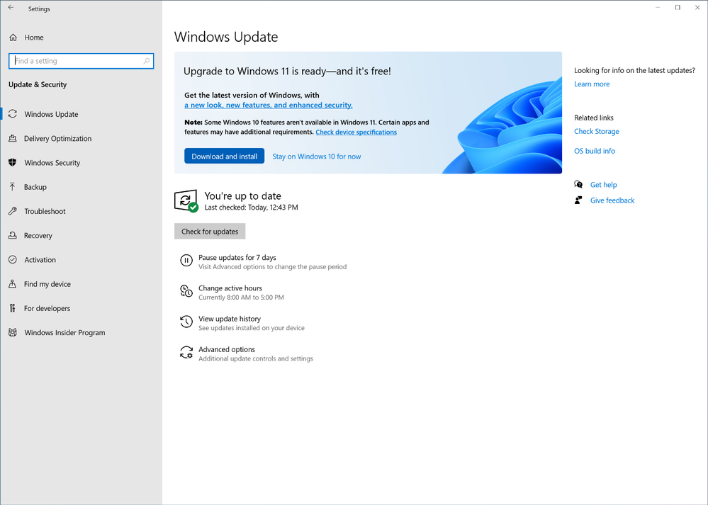
Windows 11 will be a free upgrade to Windows 10, which some compatible PCs will have access to on or around Oct. 5. (Microsoft says it will take until mid-2022 for the update to be made available to all eligible computers.) What’s important to remember is that with Windows 10, mid-cycle feature updates like moving from the Windows 10 May 2020 Update to the Windows 10 October 2020 Update usually occurs within a month or so of when Microsoft begins pushing the new feature update to PCs. You can delay the update, but not for very long.
With Windows 11, users have much more free will. On or around Oct. 5, you’ll be offered a choice to upgrade to Windows 11, or remain on Windows 10. If you choose to accept it, you can. But you can also decline the update, and remain on Windows 10 until 2025 or so, when support for Windows 10 expires. The decision to upgrade to Windows 11 is a real choice, and one you should consider carefully.
Mark Hachman / IDG
How long that choice will be available isn’t known. Even if you upgrade to Windows 11, you should have an option to “roll back” to Windows 10—a ten-day window, according to information that Microsoft has circulated to its customers.
And that all assumes that your PC will be able to receive Windows 11, too. Windows 11 arrives with some very strict hardware requirements for PCs that can run Windows 11, essentially requiring the latest Trusted Platform Module (TPM) technology as well as a recently released computer processor. Microsoft has the best of intentions here. In order to provide a secure, managed PC, Microsoft’s Windows 11 code must sync up with specific PC hardware. But those hardware restrictions have also proven to be an enormous controversy in their own right.
We reviewed Windows 11 on three PCs, including the Microsoft Surface Laptop 3 (Ice Lake), running Windows 11 Pro, as well as the Microsoft Surface Pro 7+ tablet, also running Windows 11 Pro. A third device, the Surface Laptop 4, ran Windows 11 Home. We began our formal review process with Windows 11 Insider Build 22000.184 (21H2), part of the Windows Insider Beta Channel, with the intention of monitoring it up through the formal release date of October 5. (Microsoft moved the Dev Channel of Windows 11 to future builds of Windows 11, with code that will not be released as part of the October 5 launch.)
Windows 11 Pro versus Windows 11 Home
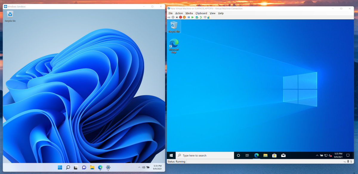
Windows 11 will ship in two different editions for home use. Windows 11 Pro and Windows 11 Home will each receive major feature updates just once per year, rather than twice. (Windows 11 Home in S Mode will also be available, though we haven’t tested it.) It appears that Windows 11 Pro will leave the functional differences between Windows 10 Home and Pro intact, offering features like BitLocker encryption, Hyper-V virtualization, Remote Desktop Connection, and Windows Sandbox.
Mark Hachman / IDG
Though we didn’t try out Windows 11’s Remote Desktop Connection, we confirmed that the Hyper-V virtualization capabilities worked, generally. Windows 11 was unable to find an Ubuntu ISO that Hyper-V downloaded, but it opened and installed a saved Windows 10 build just fine. Windows 11 also opens a copy of Windows 11 (rather than Windows 10) with Windows Sandbox, a nifty—though we suspect little-used—virtualized OS that you can use to surf the gray areas of the Web. In all, the reasons to upgrade (or not) to Windows 10 Pro seem to carry over into Windows 11 Pro.
There’s a significant new reason to consider Windows 11 Pro now, however. The Windows 11 Pro edition will be the only edition to allow local accounts, which Microsoft now calls “offline” accounts. Windows 11 Home requires you to initially sign in with a Microsoft account. We’ll talk about this a bit more in the next section. This potentially makes upgrading to Windows 11 a pricey hassle for people already using local accounts, however. If you own a Windows 10 Home PC, and you want nothing to do with a Microsoft account, it appears you’ll need to pay $99 to upgrade to Windows 10 Pro, and then on to Windows 11 Pro.
Windows 11’s installation experience
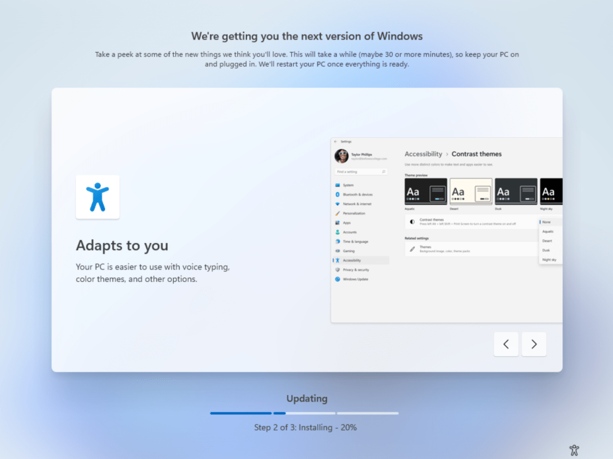
Both of our test PCs used an in-place upgrade to test Windows 11, which means that we didn’t get to fully experience the Windows 11 installation process, or the “out of the box experience (OOBE),” as Microsoft characterizes it. Instead, we installed the Windows 11 ISO via a virtual machine to see how that process plays out.
Mark Hachman / IDG
In general, installing Windows 11 feels very similar to installing Windows 10, though with a rather lovely, streamlined installation process guiding you throughout. For example, Microsoft eliminated overt options to install Microsoft 365, Cortana, and Your Phone during the setup process—at least as part of the setup process we tried out, anyway. Microsoft has tried out “personalized” setup processes before, which means that yours may be slightly different.
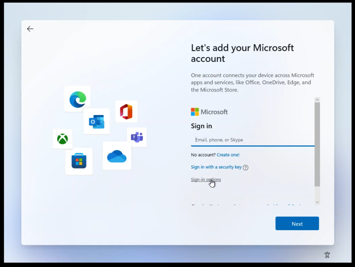
The most significant change is the elimination of local or “offline” accounts within Windows 10 Home—a fact that we were told in July and appears still to be the case. At present, Windows 11 Home PCs must be set up and administered with a Microsoft account, though local accounts can also be added later for additional users.
To enable local accounts as part of the initial setup, you’ll need to install Windows 11 Pro, either via an in-place upgrade from Windows 10 or a clean installation. During the setup process, you’ll be prompted for your Microsoft account information. Simply click the “sign-in options” link instead. The next page will offer you the option to sign in with an offline account.
We need to be clear: the “router trick” that Windows 10 allowed has vanished. Windows 11 Home doesn’t even offer you the option of proceeding without connecting to a network, and then doesn’t allow you to bypass the account login screen, either. Windows 11 Pro does.
Mark Hachman / IDG
(While Windows 11 tolerates local offline accounts, expect to see numerous little passive-aggressive nags here and there to “change to a Microsoft [or “online”] account.” Incidentally, you’re perfectly free to go online with an “offline” account. You simply won’t be able to access Microsoft services like OneDrive cloud storage, which is keyed to your Microsoft account.)
The time in which Windows 11 will install depends on a few factors: whether you’re performing an upgrade or a clean installation, the speed of your PC, whether your PC has an SSD or a hard drive, the speed of your Internet connection, and so on. Installing Windows 11 onto a new virtual machine required about 25 minutes or so, including installation, reboots, and updates. As always, we’d recommend backing up key files and so on (either locally or in the cloud) before upgrading your operating system.
Microsoft smartly uses the installation process as an opportunity to familiarize you with some of the key new features in Windows 11 while the process completes. When it’s done, you’re dropped into Windows 11 proper.
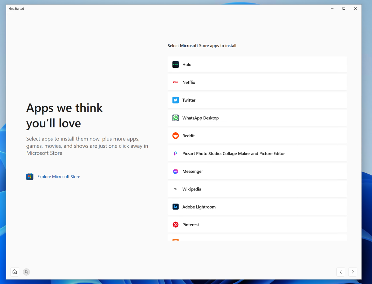
If you’re still a little nervous, Windows 11 provides a second introductory app, called Get Started, which happens to be the only “Recommended” document in the Start menu after Windows 11 is installed. Get Started is surprisingly good, offering you another overview of what’s new—a pointer to OneDrive, for example, or a list of suggested apps in the Microsoft Store—but Microsoft doesn’t promote it at all, at least in the builds we tested. We’d recommend clicking through Get Started, and then opening up the Tips app if you need further instruction. All in all, there’s quite a bit of help within Windows 11 if you need it.
Mark Hachman / IDG
(We haven’t yet seen the popup Windows 11 tips that Microsoft informed us of, but there’s a control in Settings > Accessibility > Narrator > Verbosity that may control it.)
During our in-person demonstration of the Microsoft Surface Laptop Studio, Microsoft’s corporate vice president of Surface, Pete Kyriacou, said that the laptop’s camera now can distinguish you and log you in even with a hat, glasses, or even a surgical mask. Kyriacou calls this Windows Hello 2.0. As far as we know, Windows Hello 2.0 may be limited to that particular device. Still, Windows Hello was one of the standout features of Windows 10, and the very first way in which you interact with Windows each morning. Now, Microsoft may be readying its successor for Windows 11.
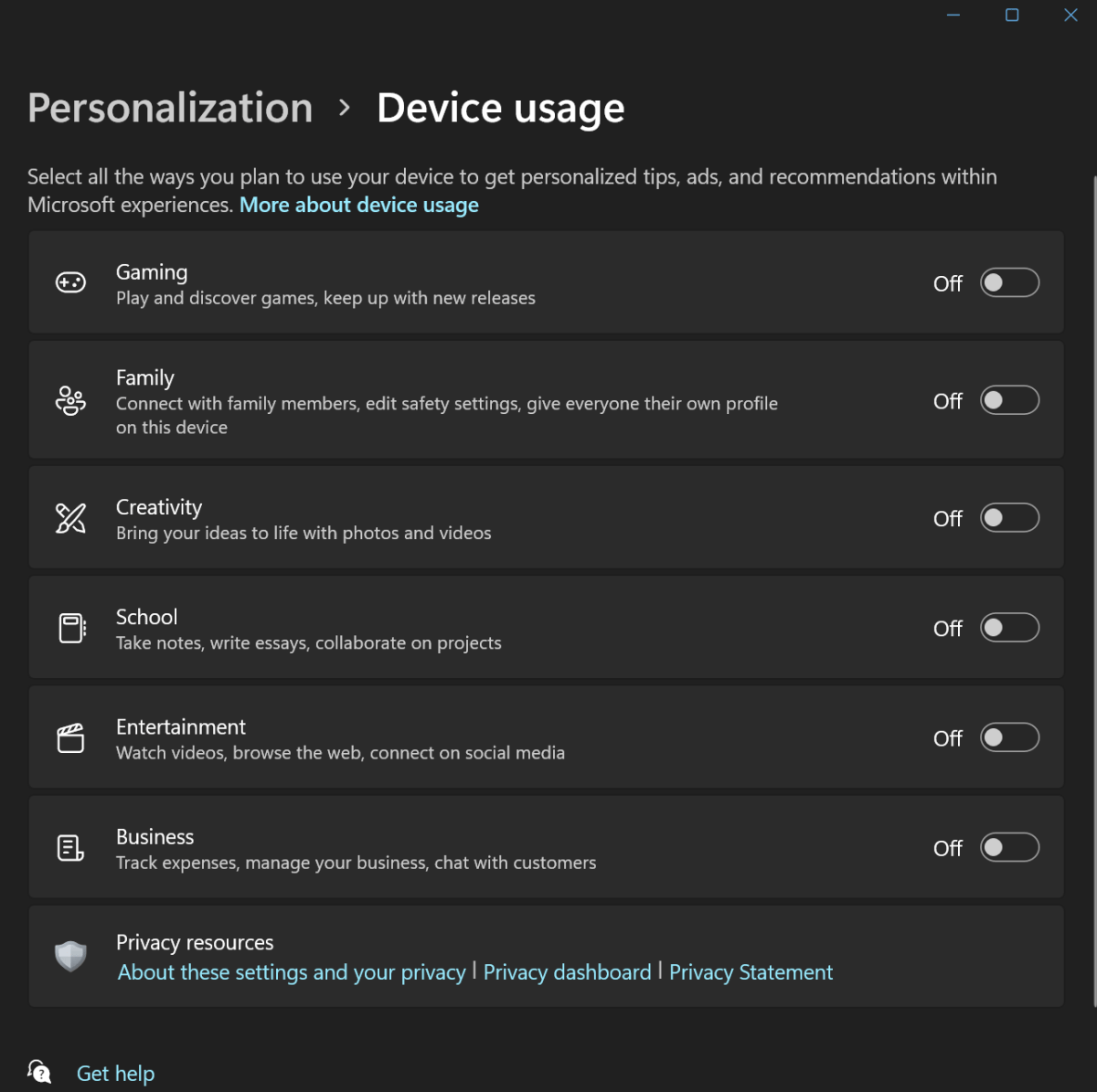
Finally, there’s an intriguing option that you can manage within Windows: Device Usage, which is controlled via the Settings app. In Windows 10, you had the option of telling Windows what you were going to use it for. This is now formally part of Windows 11, and you can select one or more of a number of use cases for your PC. These generally control what sort of suggested apps and tips you’ll see. In certain cases, such as gaming, you may be presented with special offers such as a month of Xbox Game Pass.
Mark Hachman / IDG
Taskbar
Out of the box, you’re faced with the most significant UI change in Windows 11: the updated Start menu and Taskbar. Both feel like a step backward, robbing the user of some functionality as well as visual appeal.
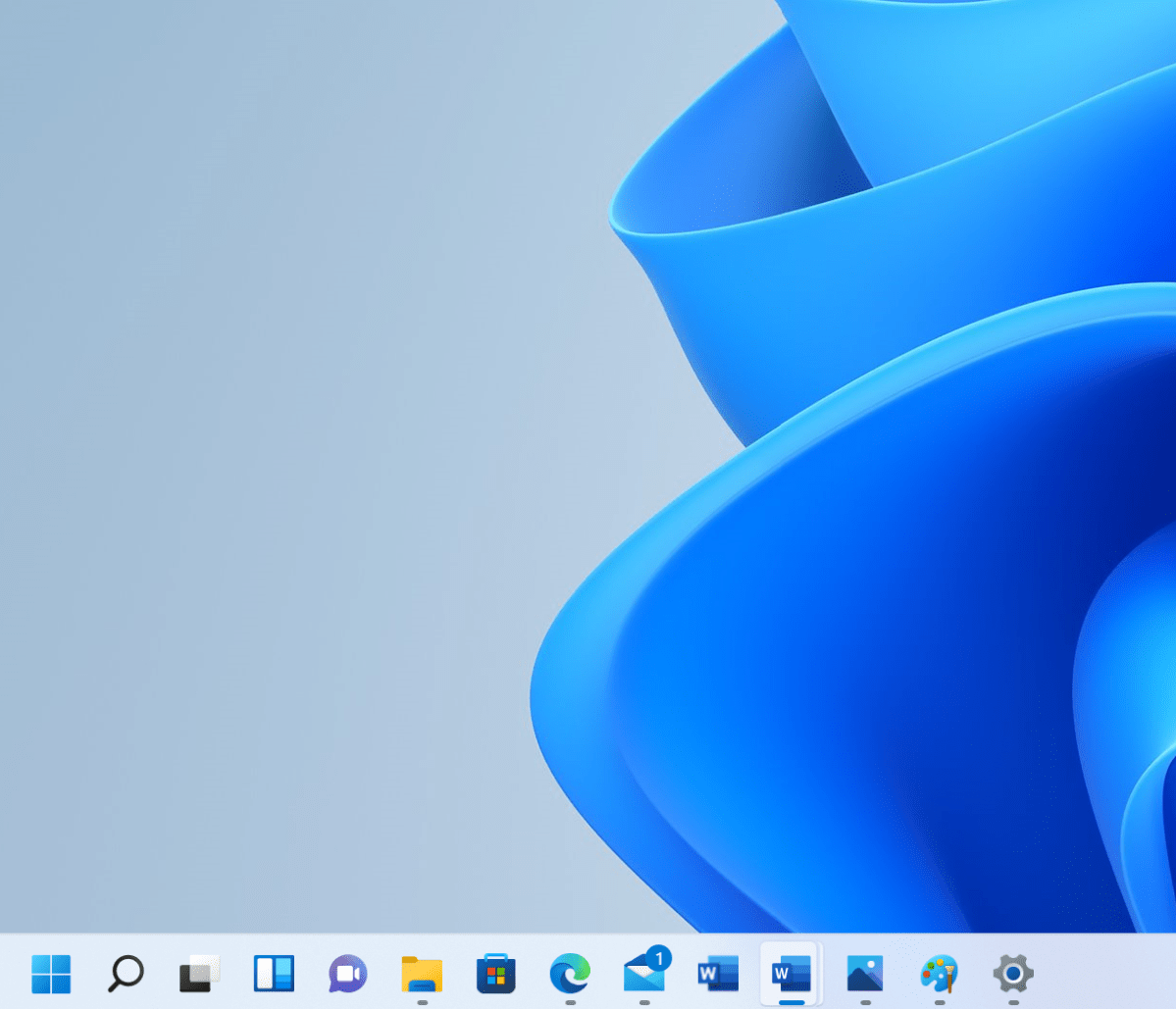
Let’s take the Taskbar, for example. Your first glimpse of Windows 11 is a row of attractive, minimalist icons centered at the bottom of your screen. In Windows 11, you can hide the Taskbar, but you can’t resize or move it elsewhere on the screen—a potentially significant issue on low-DPI screens found on cheaper laptops, where screen space is a priority. Want to use smaller icons? Windows 10 allows this; Windows 11 does not. Within Windows 10, you have the option to use labels instead of taskbar icons; Windows 11 eliminates this, forcing you to parse the new icons blindly. Other small annoyances include locking the clock to the Taskbar on only your primary display, leaving you to wonder why Microsoft thinks it necessary to leave a large swathe of your desktop untouched on your secondary monitors.

Mark Hachman / IDG
A small but vocal portion of the Internet also has complained bitterly about Microsoft eliminating drag-and-drop functionality from the Windows 11 Taskbar. In Windows 10, you can drag a file onto an open File Explorer folder, for example, and it will simply drop in. Other apps work similarly. I don’t use this feature myself, but others swear by it.
Naturally, one of the most common tasks while using the Taskbar is to launch the Start menu, and here too Microsoft falls short. By default, the Windows 11 Taskbar’s icons are center-justified, expanding outwards as you open more apps and Windows adds more icons. But the Start menu icon now appears to the left of the icons.
In Windows 10, muscle memory tells you that the Start menu can always be launched by moving your cursor down to the lower left-hand corner. In Windows 11, it’s always…somewhere down to the left, and it’s distracting trying to find it. To be fair, you can configure Windows 11 to push the centered Taskbar apps to the left, placing the Start icon back in its familiar lower-left location. That is not the default however. (You can also still use Win + R or just the Win key to search for/launch apps, as I do.)
Mark Hachman / IDG
Finally, Microsoft has largely done away with its explicit tablet-mode UI shifts. If you own a Windows 11 tablet and detach the keyboard, the taskbar icons will simply automatically space themselves a bit further apart to make them easier to interact with. Windows 11 will also display a small keyboard icon in the taskbar to allow you to touch-type, too.
The new Start menu
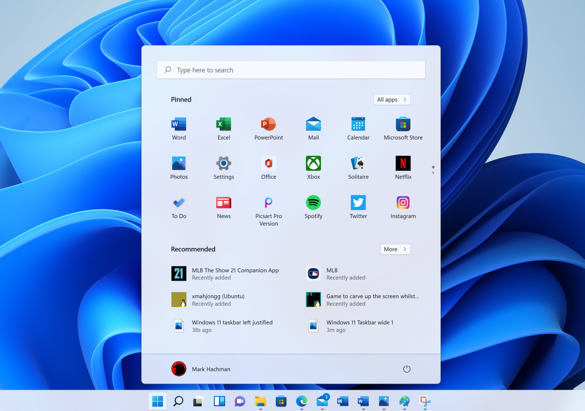
Instead of a lively, reconfigurable Start menu filled with colorful tiles, Windows 11 adopts the rather plain look of Windows 10X, the would-be Chromebook killer that Microsoft canned in May.
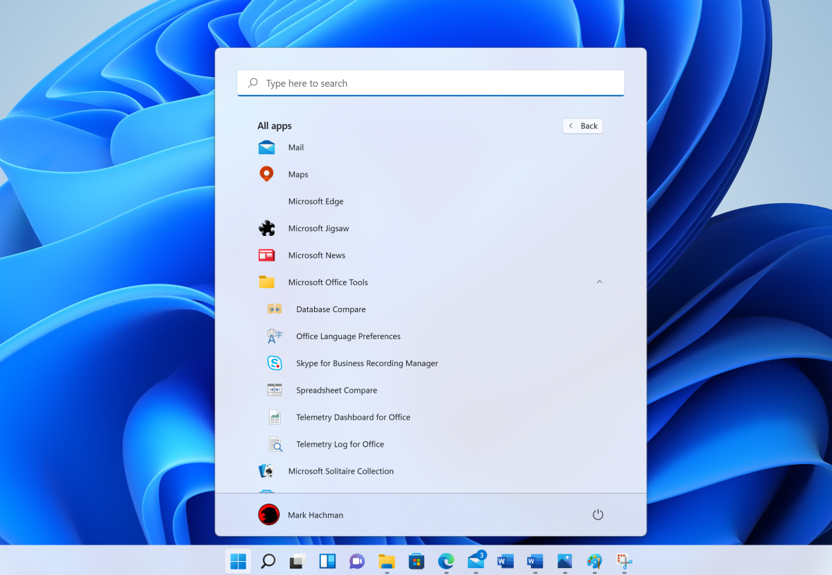
Windows 11’s Start menu is simply a collection of rather simplistic icons, seemingly at random, with a list of “Recommended” (or, to be more accurate, “Most recent”) documents at the bottom. Within Start, two small buttons (“All apps” and “More”) open up to a list of alphabetically arranged apps and a longer list of documents in a separate screen. Microsoft also put a search box at the top of the Start menu, which simply opens up the Search app to the right of the Start icon on the taskbar. It all feels singularly uninspired, dull, and slightly depressing, like a store shelf of prepackaged sandwiches or 1970s architecture.
Mark Hachman / IDG
The Start menu also feels functionally worse than Windows 10. While the “pinned” apps at the top of the Start menu can at least be manually moved around, Windows 11 does not allow the pinned apps to be alphabetized, grouped, or even put into folders, as with Windows 10. (Apps can only be “moved to the top,” which is just sort of sad.) A miniscule pair of dots to the right side of the app drawer is supposed to visually indicate that you can scroll down to find more apps. Good luck figuring that out! Finally, the Start menu as a whole cannot be resized, and there’s no full-screen option.
Mark Hachman / IDG
Can you right-click on an app on the Taskbar and pin it to your Start menu? Nope. Installed apps drop into the “All apps” overflow menu within Start, and only from there can you then pin it to Start’s pinned apps. I was at least able to save an Office.com document as an app and save it directly to the pinned apps, but trying to pin Slack to the Start menu’s pinned apps required fishing it out of the “All apps” overflow menu. Pinning a webpage from Edge almost requires its own tutorial. And I spent far too long trying to find where Windows 11 had hidden our corporate VPN app—I finally found it, not as a standalone listing, but inside a folder in the overflow menu which had been alphabetized under the developer’s name.
Confused? OK, now imagine actually using Windows 11.
Notifications and Action Center
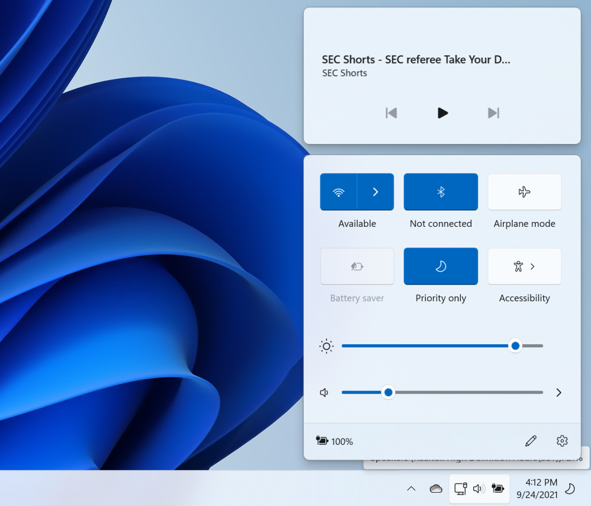
In Windows 10, the lower right-hand corner of your screen is known as the Action Center, and each little icon is clickable. Not so in Windows 11, which groups the icons into two clickable “buttons,” each of which can be seen when you hover over them with the mouse. (To the left of those icons is the taskbar’s overflow menu, which hides icons like OneDrive, Windows Security, and others behind a caret menu.) As you may have intuited from our discussion of the Taskbar, Notifications and the Action Center are only accessible from the primary or active display.
Mark Hachman / IDG
In Windows 10, the Action Center hides all sorts of useful little functions, including VPN options, screen snip, the ability to connect to other screens and devices, and so on. In Windows 11, this has been pared down considerably, to Wi-Fi and Bluetooth toggles, Airplane mode, a Battery saver mode, Focus assist, and an Accessibility menu. You still have the option to add functions like Nearby Sharing, the blue-light blocking Night Light, and more, but you’ll have to manually add them by clicking the tiny little “pencil” icon at the very bottom of the Action Center.
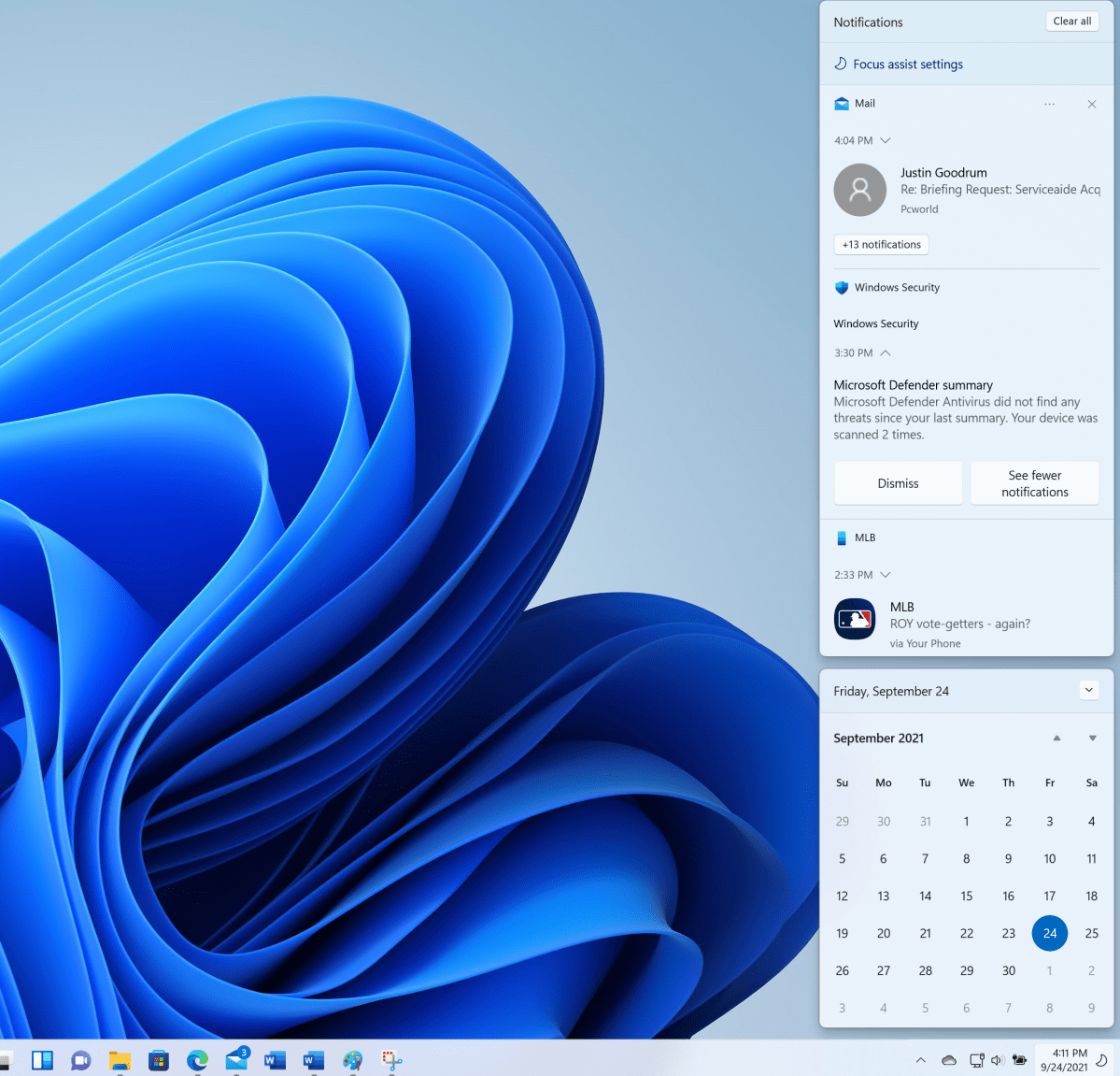
Notifications provide a summary column of alerts that Windows and other apps send: new email, upcoming meetings, and so on. Oddly, in Windows 11 part of this column has now been replaced by a non-functional calendar. Want to add an event to your personal calendar? In Windows 10, a small pane allows you to do this. In Windows 11, that pane is gone, and right-clicking or double-clicking a date does absolutely nothing to what is basically a bit better than wasted space.
Mark Hachman / IDG
To be fair, in Windows 11 notifications seem to be organized far more usefully than within Windows 10. That may be because the calendar reduces the available screen space for notifications, forcing Microsoft to be economical.
Revamped Windows Settings menu
I don’t really like how Microsoft scatters buttons throughout the Windows shell to point users to overflow menus like the Start menu’s “More apps.” In the redesigned Settings menu, however, Microsoft uses these buttons, drop-down menus, and “breadcrumb” navigation (placing, for example, a clickable System>Sound>Properties at the top of the screen) so that you can navigate back and forth) to much better effect.
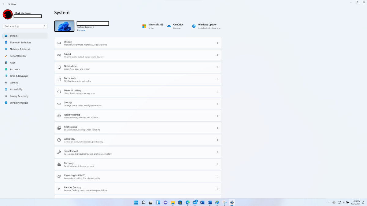
That’s good, because Settings now oversees a ton of information. Yes, it can feel a trifle overwhelming in places as you dig down through layers of menus. A search box to the upper left helps here, with dynamically generated results as you type.
Mark Hachman / IDG
Settings also does away with the overarching Settings index page found in Windows 10, launching directly from within Settings > System, with direct shortcuts to Display, Sound, Notifications, and other pages. This does away with an additional click, though it’s a bit disconcerting to be dropped right into a Settings section. At the top, you’ll see the current theme or background you’ve set within Windows, too. If your Windows 11 desktop background is dark, you may see Windows 11 automatically enable Dark Mode.
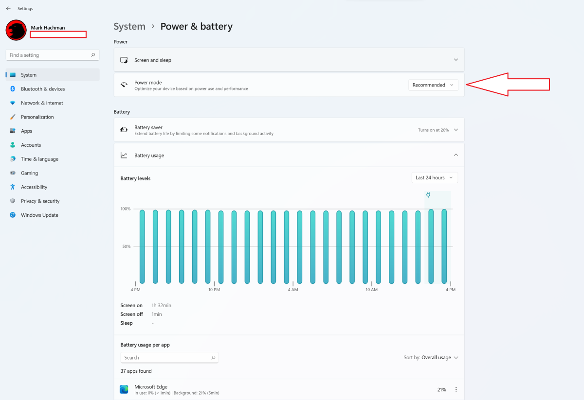
Windows 11’s Settings menu hides little goodies like Game Mode, a toggle that allows Windows to turn off unnecessary tasks while playing a game—including Windows updates and restarts!—and smooths frame rates by default. (We didn’t test this latter function in Windows 11 yet, but it sometimes proved invaluable in Windows 10.) I also like the visual representation of Windows 11’s battery consumption, which sort of reproduces the Command Line command powercfg /batteryreport and its graphical report of your laptop’s power usage. This is also where the performance slider is hidden, by the way, to get more performance out of Windows 11.
Mark Hachman / IDG
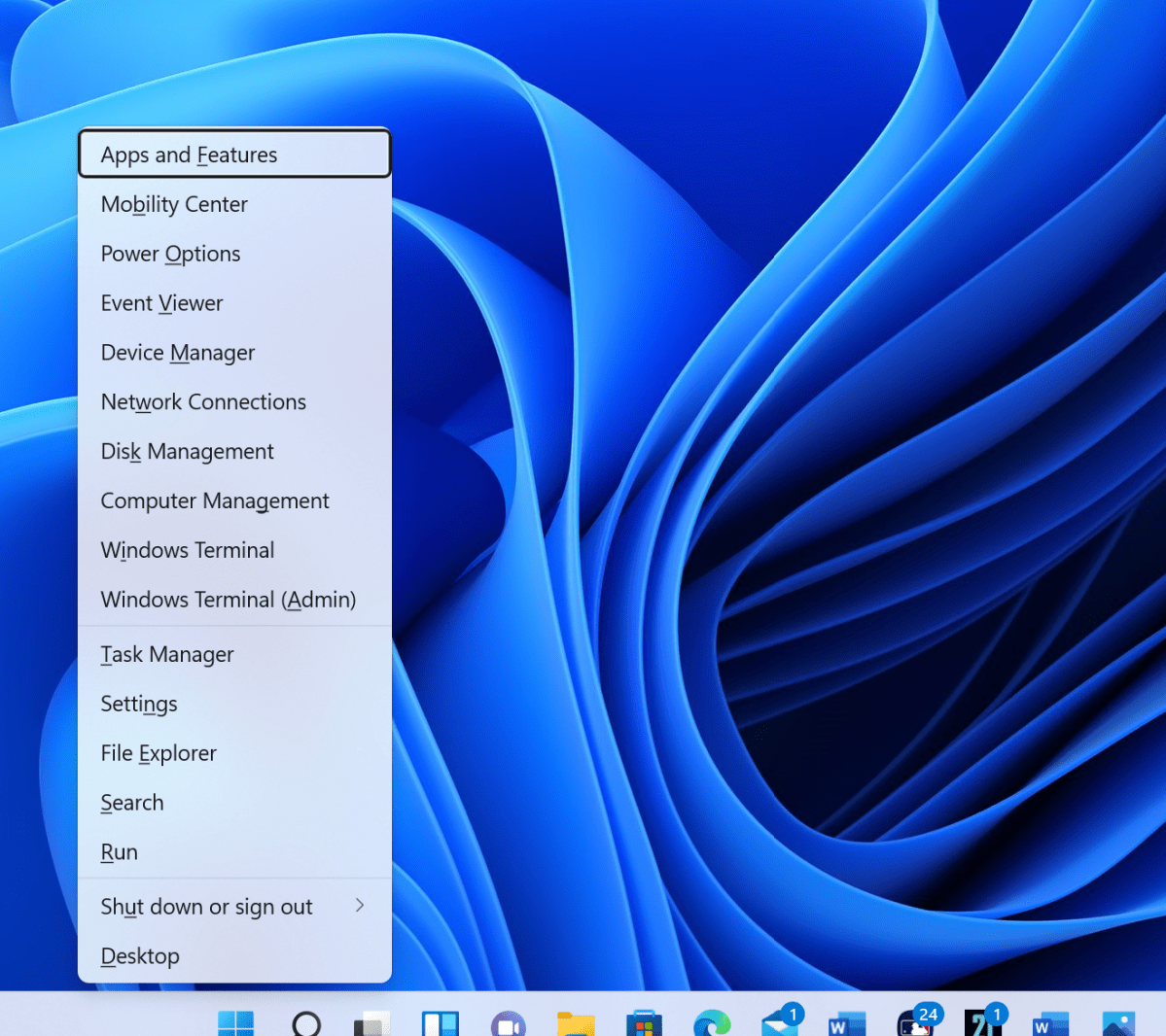
There’s still cruft. Do I really need to download offline maps and manage them? Has Windows Update’s Delivery Optimization ever worked? Why is Windows Security still its own separate menu, and not just part of Settings? And yes, the Control Panel still exists, too. There’s just far less reason to visit these days.
Mark Hachman / IDG
Search, Cortana, and Timeline
Windows 10 launched with helpful assistant Cortana perched next to a dedicated search box designed to search both your PC and the web for whatever you were looking for. Over the past six years, Cortana has faded away, relegated to a semi-functional app that really doesn’t do all that much any more. Cortana isn’t even one of the pinned Windows 11 apps!
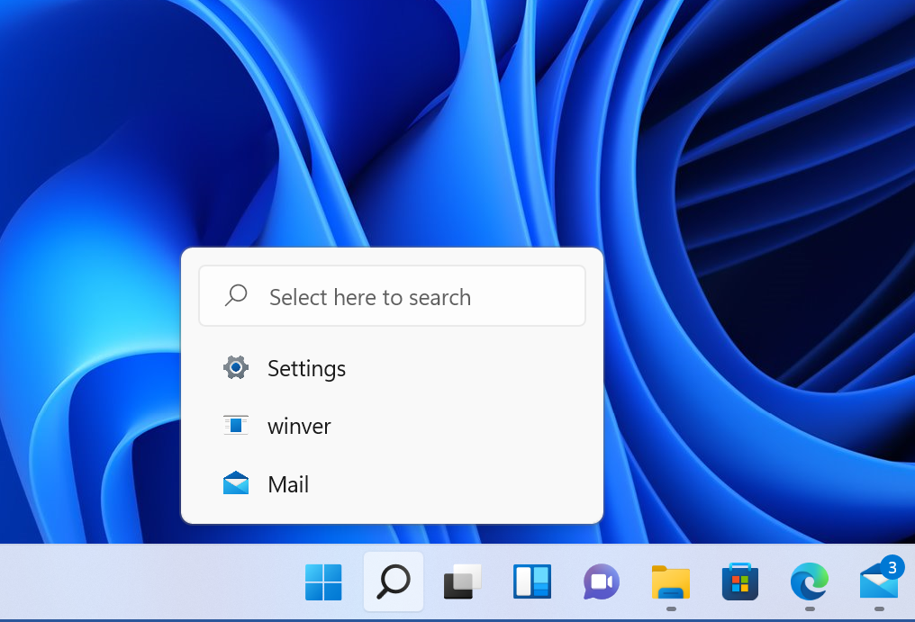
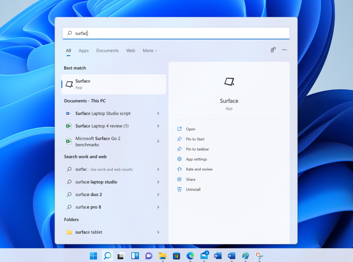
Instead, Microsoft has scattered search bars around Windows 11 seemingly willy-nilly There’s a Search icon on the taskbar, and a search box at the top of the Start menu, and another at the top of the new Widgets pane, which we’ll talk about later. Only the former two search your PC; the latter only searches the Web, using the Bing search engine by default. It doesn’t matter whether you use the Search app or the Start menu, or even the search box that appears when you hover your mouse over the Search icon on the taskbar, however. You’ll end up in the Search app regardless.
Mark Hachman / IDG
To its credit, Search does a solid job of listing relevant apps, documents, web results, and more to match your search terms. Search also dynamically searches as you type, which speeds up the process. Nevertheless, it all still feels somewhat incoherent.
Next to the Search icon is Task View, which hasn’t changed much from Windows 10. Task View and the Alt + Tab functionality still overlap considerably. The Alt + Tab functionality shows all of the windows that you have open, including the option to include the most recent 3 or 5 tabs within Edge. Microsoft introduced Task View in Windows 10 as a way to shift between arrangements of various windowed apps on laptops and other single-screen devices. It’s still an excellent tool for working on the road, but you might not find it as useful when your PC has access to multiple physical monitors.
Mark Hachman / IDG
What doesn’t come with Task View is the Timeline function, which tracked which documents and Web pages that you’d used as a way of picking up where you left off on multiple PCs. Timeline is somewhat preserved within the shared browser history within Microsoft Edge—if you use Edge—but the lack of Timeline has prompted howls of sorrow from some corners of PCWorld.
Teams Chat
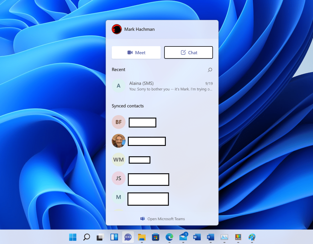
After the death of My People, Microsoft’s latest effort to connect you with your friends via your PC is Chat (sometimes referred to as Teams Chat), which lives in your Taskbar right next to the File Explorer folder icon. It’s slow, unnecessary, and the privacy implications are somewhat unsettling, too. We’re not sure you’ll want anything to do with it.
Mark Hachman / IDG
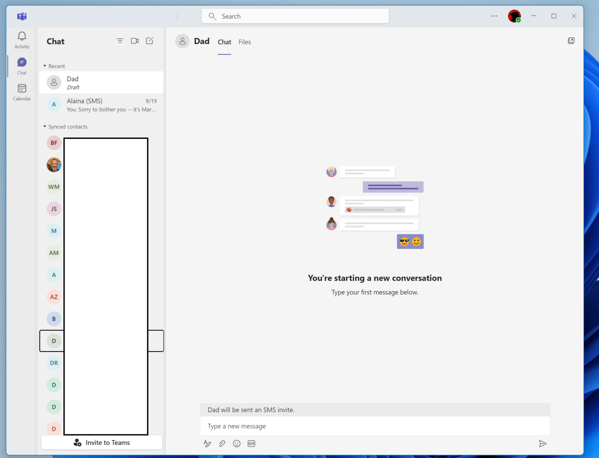
Chat expects you to manage your personal life via the personal Microsoft Teams experience Microsoft launched earlier this year, via a separate mobile app and now Windows 11. During setup, the app asks you to log in and connect your Microsoft account to any Outlook.com and Skype.com contacts, then provides you a Teams-like interface to hold chats, launch video calls, and so forth. Upon clicking the Chat icon a second time, a list of frequently-accessed contacts appears, with shortcuts to perform chats and make video calls.
The transition from the Chat icon to the fuller Teams experience required several seconds to complete, and that experience felt very simplistic and slow. I have concerns on several fronts. First, anyone who has your linked email and/or phone number can message you—there’s no global “do not disturb” feature, and you can’t simply delete your profile in Teams to make yourself non-discoverable. Yes, you can remove your email or phone number from your Microsoft account to hide yourself, but why should you? Why does managing your presence in Teams require downloading the mobile app? It also seems a bit arrogant to expect that Microsoft thinks we’ll drop our own established networks of messaging apps to migrate them all to Teams. It’s this last point that will likely doom Teams Chat, eventually.
Mark Hachman / IDG
Widgets
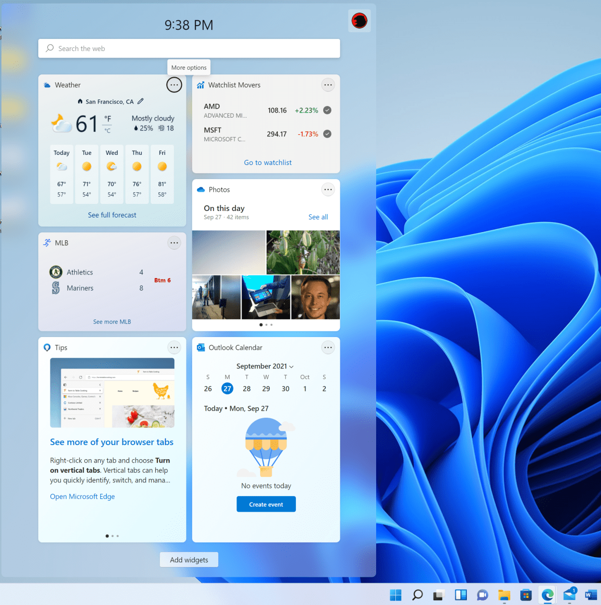
Widgets is one of the major new additions within Windows 11, a gargantuan drawer of news and information that slides out from the left-hand-side of the screen at the click of its Taskbar icon. Like many other things in Windows 11, the Widgets drawer isn’t resizeable.
I’m torn on the concept of Widgets. As a journalist and hungry news consumer, I love that I can pop out Widgets, see relevant Windows Start news and information, and review my Outlook calendar, see Windows tips, photos, and more. I also appreciated the Cortana-powered summary of your day that originally appeared in Windows 10. In a not-so-strange way, Widgets is simply the “Live” in Windows 10’s Live Tiles, relegated to its own corner of Windows. It’s as if someone at Microsoft said, “Let’s separate what makes Windows fun from what makes Windows practical, and assign them their own locations.”
Mark Hachman / IDG
But from a user’s perspective, Widgets can be a distraction, too. Microsoft evidently took its News Bar concept and rejiggered it into a quasi-Facebook feed: an endless scroll of celebrity gossip, news, and more. If Microsoft still had its so.cl network, it would live here. Widgets can be “removed” from Windows 11, but I’m not entirely sure they deserve to be there in the first place.
Navigating File Explorer, Windows, and the new Snap View
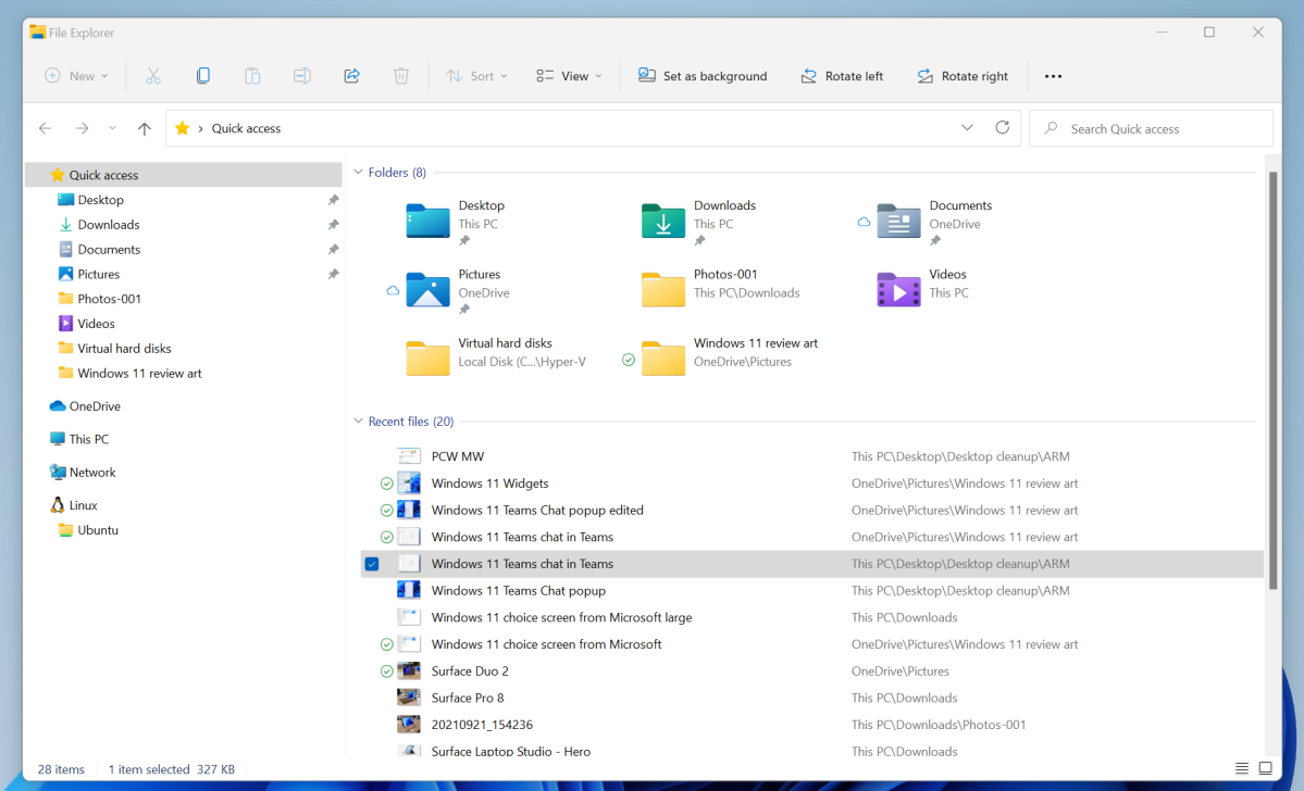
Navigating File Explorer in Windows 11 feels like Microsoft ignored what users wanted in favor of what its engineers could add instead. Remember Windows Sets, the 2017 tabbed interface that incorporated File Explorer, Mail, Edge, and more? Users may not ultimately have wanted the Sets interface as a whole, but they’ve been asking for a tabbed File Explorer for years. Microsoft hasn’t given that to us, leaving File Explorer’s windowed organization largely unchanged.
Microsoft’s File Explorer and other Shell apps show off the rounded corners and Fluent Design principles that first emerged within Windows 10, evolving them to include “materials” like Mica. Microsoft also reworked some of the system icons, so the Pictures and Downloads folder, for example, feel fresh and modern.
Mark Hachman / IDG
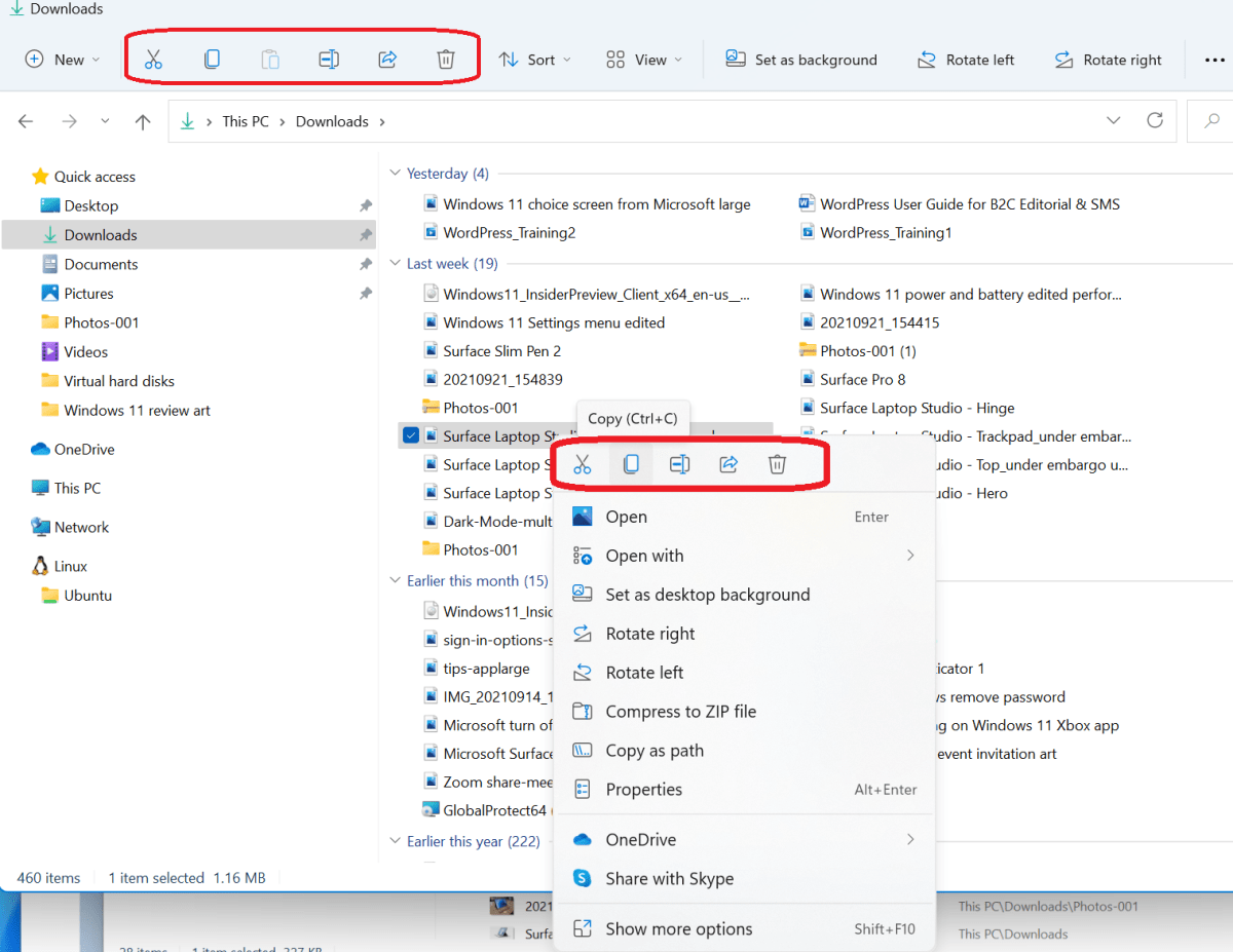
For me, that’s where Windows 11’s design improvements stop. Icons are one thing. But Windows 11 also adds a row of shortcut icons to File Explorer that, even after using the OS for weeks, simply don’t effectively communicate their purpose. I can certainly figure out that the “scissors” icon means “cut” and that the “garbage can” icon means “delete,” but I still have trouble recognizing which icon represents “rename,” “paste,” and “share,” without specifically thinking about which icon represents which function.
Right-clicking on a file places these UI shortcuts at the top of the menu, where at least I can hover over them. But the option to, say, rename a file only appears there in that row of icons. Or does it? No, you can also scroll down to “Show more options” and get a second, expanded, Windows 10-like column of menu options. It all feels like Windows 11 was simply tacked on to it all.
Mark Hachman / IDG
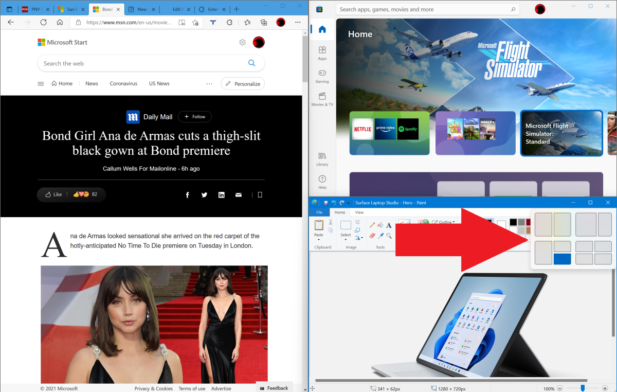
The one place I feel that Microsoft got it right was in the expanded Snap View icons that appear when you hover your cursor over the “maximize window” shortcuts in the upper right-hand corners of window panes. Remember, Windows Snap allows you to drag a window into the sides or corner of the screen; they’ll then expand to fit that quadrant, allowing you to neatly organize up to four windows on your monitor. In Windows 11, you have more options: thin columns, wider columns, and so on. Snap is essentially a simplified version of the Fancy Zones app from Microsoft’s Power Tools, but it’s still a solid, useful addition to the Windows 11 user interface.
Mark Hachman / IDG
Windows 11’s behavior has also drastically improved when undocking a laptop or tablet, or connecting a second monitor. If you have an additional display or two docked to a Windows 10 laptop, you undoubtedly have your app and file windows arranged just so. After undocking, however, all of that careful organization dissolves into chaos, especially when redocking. Windows 11 now remembers where those windows live, minimizing them when undocking and then returning them to their proper locations when redocking. Bravo!
Microsoft Edge and the lack of browser choice
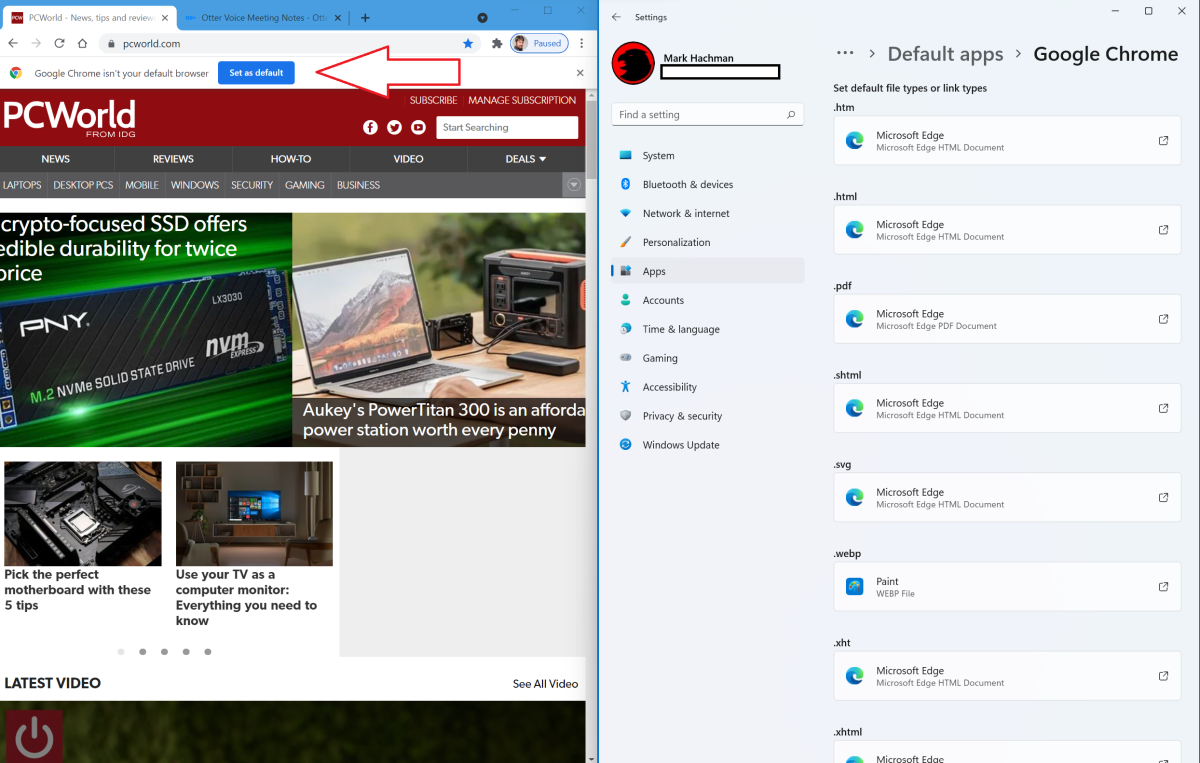
If Microsoft Edge were the dominant browser within the PC ecosystem, we’d call Microsoft’s browser “choice” behavior in Windows 11 monopolistic. As it is, it’s terribly sleazy.
Microsoft Edge is now decoupled from the operating system, and so there aren’t any overtly Windows 11-ish enhancements to the browser. Internet Explorer has also disappeared, save for running within Edge as Internet Explorer Mode. As it is, Edge is Windows 11’s default browser, and that’s fine. Edge runs on the Chromium underpinnings, accepts Chrome plug-ins, and runs smoothly and efficiently. I often use it as my daily driver, with no regrets.
Mark Hachman / IDG
But there are many good to excellent browsers in the market, and there’s absolutely no reason not to simply experiment with our recommended browsers to find one you’ll love. Microsoft makes this vastly more difficult than it needs to. In the Windows 11 Settings menu, Windows 11 now forces you to enter a default app for each file type: HTML, WebP, . XHT, HTTPS, and so on. There is simply no “all” option or checkbox to change your browser in one fell swoop—as if they were even necessary. It’s a steaming pile of unfriendly corporate behavior, and it stinks to high heaven.
The revamped Microsoft Store
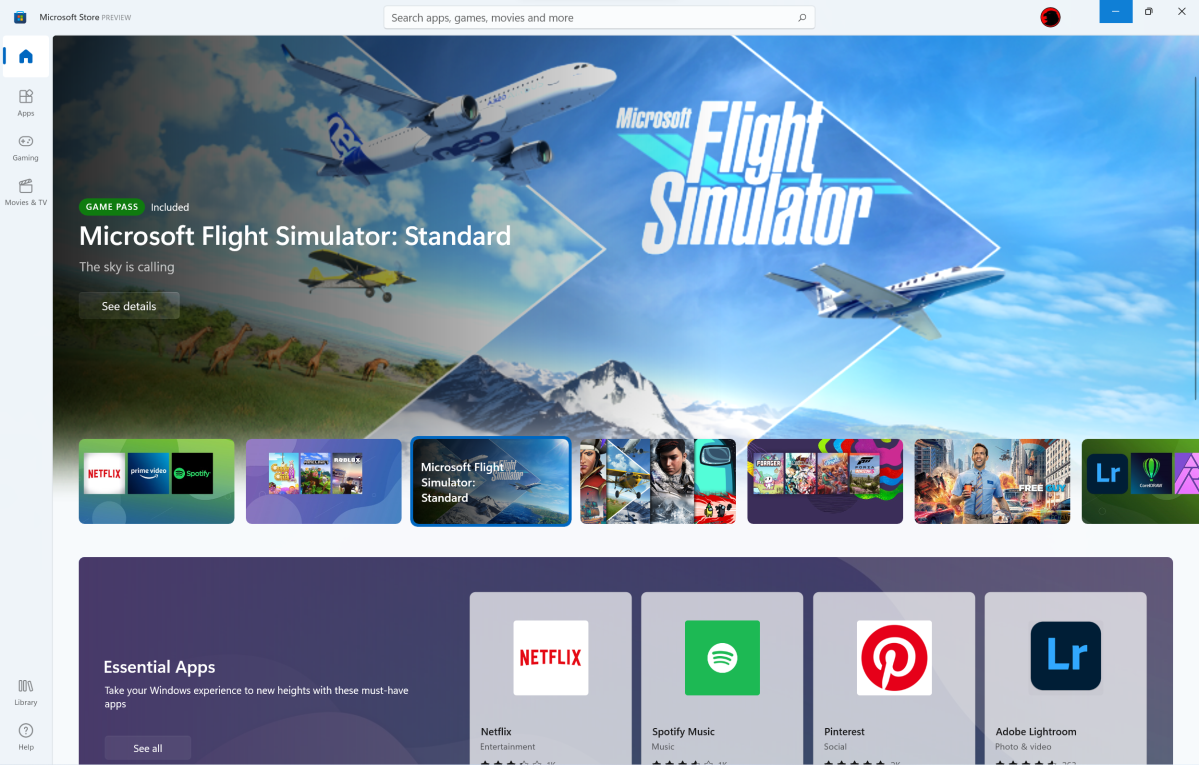
The Microsoft Store app has felt incomplete for years, and the admittedly attractive overhaul of the app does little to change that. Microsoft Store serves an update center for any built-in Windows apps, plus anything you’ve purchased from the Store itself. Everything here is more nicely organized, with attractive, dynamically refreshing blurbs at the top of each section: Home, Apps, Gaming, and Movies and TV.
Mark Hachman / IDG
It all still feels somewhat lifeless, like a sports arena when no games are being played. The Apps section simply highlights how few apps move through Microsoft’s Store, especially the Games section. If Caesars Slots Free Casino is still listed among your “best selling games,” Microsoft, you have many issues to work out.
The most significant objection I have to the “Movies & TV” tab is that there’s a staggered list of “New Movies,” then “Best TV streaming apps,” then “Top-rented movies,” and then “Explore a world of music.” Microsoft, you don’t even sell music any more, remember? That died with Groove. At the very least, Microsoft, focus “Movies & TV” on genres and new releases, with prominent shortcuts to new movies to rent and buy. Tell me what’s on sale. Relegate the music apps to, you know, the Apps tab. There’s so much that Microsoft needs to fix with its Store app that goes beyond simple UI.
Changes and updates to Windows 11 apps
Microsoft has detailed some of the proposed changes arriving in the built-in Windows apps in our separate story. So far, we’ve seen updated the rounded corners and other visual elements of Windows 11 across the board, but there have been other, more functional additions that we’ve had a chance to try out.
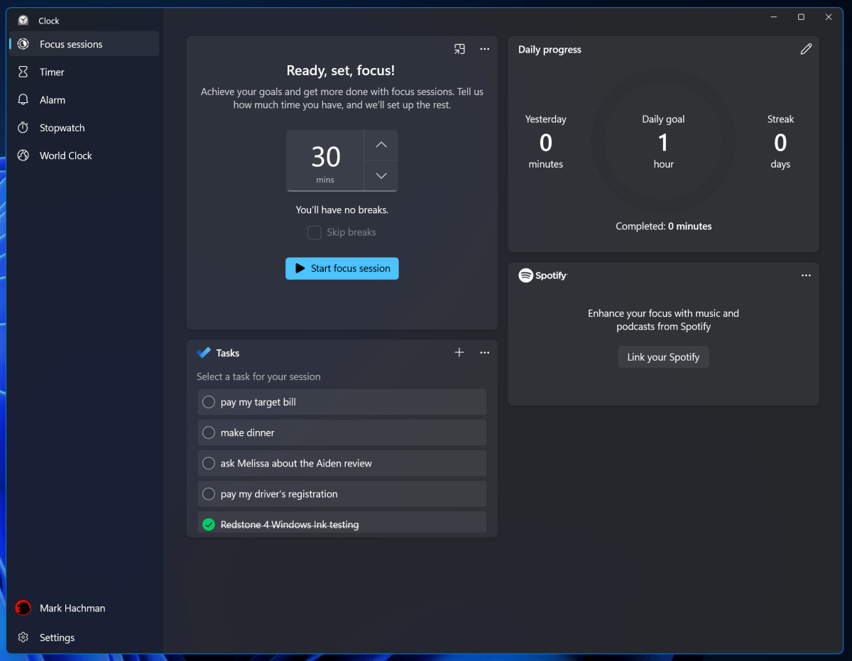
The humble Clock app has been revamped to include Focus Sessions, which simply incorporates the Pomodoro Technique: focus intensively on a task for a period of time, then relax briefly, focus again, and so on. The idea is that you mentally agree to shut down distractions to get the job done. Clock now links to Spotify, for those who like to listen to music while concentrating. For me, anything musical is a distraction—that’s why “no whistling in the newsroom” is a thing! I also don’t know why Focus Sessions doesn’t automatically trigger Windows’ Focus Assist, where notifications are automatically blocked. Still, this is a good first step. Microsoft is feeling its way forward in a direction many of us can appreciate.
Mark Hachman / IDG
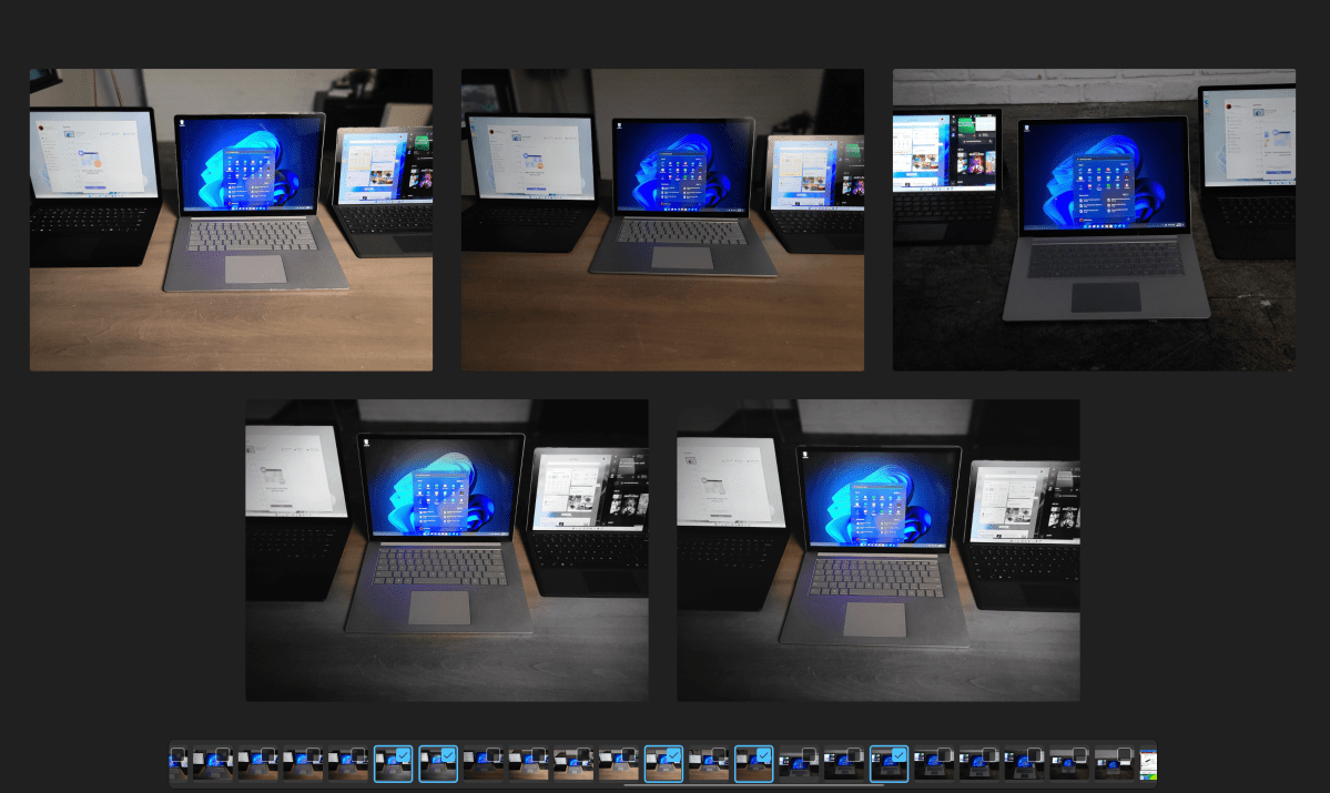
Our original review indicated that the updated Photos app and the update to Paint had been left out of the “release” version of Windows 11. On Oct. 3, we began seeing those release as part of a Windows Store update. Photos’ most significant change are a row of thumbnail images at the bottom of the app for easier image picking, which you can use to select and compare multiple images. Unfortunately, it can take roughly twenty seconds or so for OneDrive to “find” the photos and present that navigation bar. (I imagine it’s much faster for photos stored locally on a PC.)
Mark Hachman / IDG
Paint, too, lives on within Windows 11, with a redesigned, more intuitive interface. It’s otherwise the same app, however.
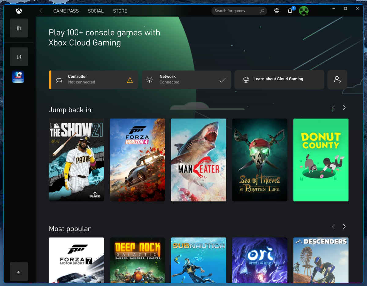
Microsoft also appears to give the revamped Xbox app pride of place during some installations. Part social network, part games library, the Xbox app connects you to your friends, letting you see what they’re playing, team up for multiplayer adventures, and so on. The piece de resistance is Xbox cloud gaming, which has finally arrived on the Xbox app for Windows. Provided you have a game controller (Bluetooth or wired) and a 10Mbps Internet connection, cloud gaming streams 1080p quality games from Microsoft’s cloud servers directly to your PC, provided that you pay for a Game Pass Ultimate subscription. It’s a surprisingly good replacement while Xbox Series X consoles or GPUs remain in short supply, though it will never quite replace a console or a gaming PC.
Mark Hachman / IDG
We’re not seeing changes to other built-in apps like OneDrive, To-Do, and Maps, some of which continue to toil in obscurity. (Did you know that Maps has access to traffic cameras, so you can actually look at your commute before you set out?) We should also note that you should see Office apps like Word and Excel finally reflect the thematic choices you’ve made in Windows, flipping to Dark Mode if you’ve selected it for the operating system.
Windows 11 also includes a somewhat improved way of interacting with apps: voice dictation, which has been present in Windows for years but has now steadily improved. Tapping Win+H opens the dictation microphone, which in Windows 11 includes an additional option for injecting AI-determined punctuation. No dictation app is perfect, though Otter.Ai and Google’s Live Transcribe work best for me. Windows’ transcription accuracy is within shouting distance of the other two, however, and I have to expect the more I use it the better it will become.
Mark Hachman / IDG
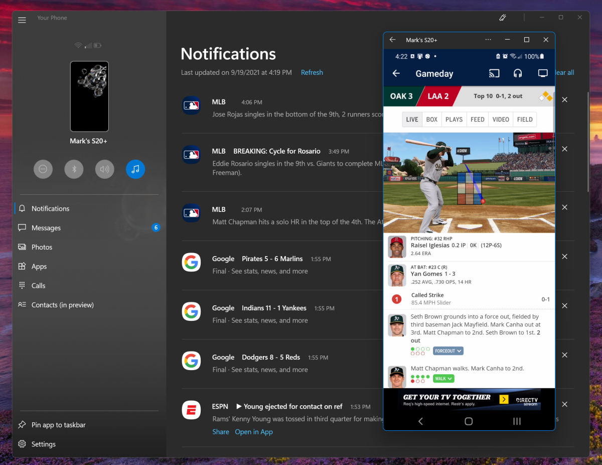
Finally, Microsoft deserves a quick shoutout for the Your Phone app. If you don’t like what Microsoft is doing with the its Teams Chat app on the Windows 11 desktop, you should know that you can connect your Android phone to your PC and interact with it via Your Phone to place calls and send texts. The only odd aspect to this relationship is that Samsung phones (as well as the Surface Duo) benefit from a beefed-up Your Phone experience. Here, Your Phone allows you to remotely interact with your phone’s desktop—even pin multiple Android apps from phone to your Windows 11 PC’s taskbar and Start menu! That is very, very cool…and a nice stopgap until you can run Android apps inside of Windows 11, a much-touted feature that wasn’t ready in time for launch.
Terminal replaces PowerShell, updates Windows Subsystem for Linux
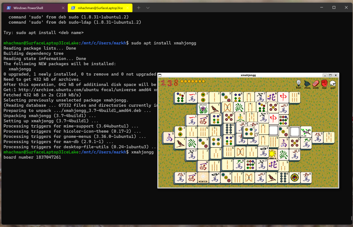
Windows has three (!) command-line utilities: Command Prompt, PowerShell, and Terminal. You can think about each one as sort of a superset of the others, with Terminal, debuting in 2019, being the most powerful. All three are present in Windows 11, though you really don’t need to open any of the three beyond Terminal. Terminal, in fact, allows you to create additional tabs in which you can open Command Prompt, PowerShell, or more. (You may find yourself wondering why Windows 11’s File Explorer can’t do this.)
Mark Hachman / IDG
Why use a command prompt of any sort? For one thing, there are still commands that can make your life easier. But perhaps more importantly, it’s an easy way of exploring a simplified version of the Linux operating system via the Windows Subsystem for Linux that was introduced early in Windows 10’s development. Microsoft has now moved on to Windows Subsystem for Linux 2 (WSL2), which introduced GPU compute last year as well as support for GUI apps in May. There’s even a simplified command that Microsoft has added to WSL2:
wsl.exe --installThat will take care of much of the nerdy setup in just a single line of code. For more, here’s our tutorial on how to add Linux apps to Windows, either Windows 10 or Windows 11.
To be fair, WSL2 is largely a curiosity, since you’ll probably find most Linux apps have a Windows counterpart. Still, if you’ve ever wanted to play around in Linux or see what Linux apps look like, WSL2 in Windows is still a neat way to do it.
Under the hood: DirectStorage, Dynamic Refresh, AutoHDR, performance increases
In addition to what you can see and interact with in Windows 11, there are also improvements and conveniences Microsoft made under the hood. Some of these could eventually sell Windows 11 all by themselves.
Microsoft told users of three ways that performance will improve under Windows 11: foreground prioritization, sleeping tabs within Edge, and quicker resumption from sleep.
Performance can be measured in several ways. In terms of actually running apps, our early performance benchmarks of Windows 11 indicated that there was not an enormous difference from Windows 10, within expectations. Those observations were in line with what we saw as development continued. Anecdotally, however, Windows 11 feels less responsive, slower, and heavier than Windows 10—there’s some lag during app startup, and there have been cases in which Edge pages took a second or two to load when paging forward and back. Some apps just loaded more slowly than we expected, compared to Windows 10.
That flies in the face, somewhat, of what Microsoft calls foreground prioritization, a fancy name for simply giving the apps you want to work on their fair share of CPU and memory resources. Microsoft has previously showed this off by opening Word and Excel while a resource-intensive application was already running in the background. In Windows 11, some of the resources that “big” app consumes will be routed to those foreground apps, allowing them to run more smoothly. I’m not wholly convinced.
Microsoft’s statements about Windows 11 laptops resuming more quickly from a sleep state feel right, though. Ideally, we’d have a pair of identical laptops running Windows 10 and Windows 11 to compare. But simply putting Microsoft’s Surface Laptops and Surface Books into sleep mode, resuming, and then comparing them to our test machines does show a noticeable difference of a second or two. It’s a far cry from the bad old days when rebooting or resuming your PC meant fetching a cup of coffee while you waited, but yes—there’s welcome improvement here.
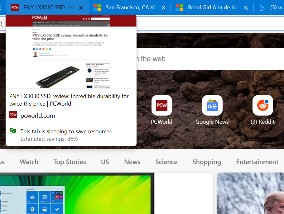
Sleeping Edge tabs make a difference, too. As you probably know, many browsers preserve a row of tabs while closing them, including Microsoft Edge. In one test I tried, I took my window of 35 tabs, closed it, and restarted Edge. Most of the tabs opened in a “sleeping” state, not consuming resources. Those 34 tabs required 1.47GB of memory to maintain. After clicking on all of them to put them in an active state, they required 4.07GB before further settling down to about 3.6GB. Either way, Edge’s sleeping tabs saved my PC quite a bit of RAM.
Mark Hachman / IDG
Windows 11 also includes certain improvements that won’t appear within a particular app, but will improve Windows 11 overall. These include both general performance improvements, but also new features like DirectStorage, Dynamic Refresh Rate, and AutoHDR.
As we noted earlier this year, DirectStorage (and Nvidia’s RTX IO) lets NVMe SSDs send data directly to the lightning-quick dedicated VRAM on your graphics card, bypassing the usual route through the CPU and general system memory. Microsoft has already implemented DirectStorage on the Xbox Series X, and it’s surprisingly powerful: Microsoft calls this Quick Resume, and switching to a Quick Resume game means switching to the game—no introductory title screens, menus, or whatnot. Implementing this on the PC in some fashion would be a decided plus for PC gaming, especially if we see something similar to Quick Resume. Right now, we don’t know if we’re going to get it, or when.
DirectStorage support will be present in Windows 11 at launch, Microsoft has told us. (Games that implement DirectStorage will be compatible with Windows 10 version 1909 or later, too.) But game developers will also need to support the DirectStorage SDK, Microsoft added, and so far Microsoft has not announced any Windows 11 PC games that have done so. Microsoft has also said that DirectStorage will require a terabyte NVMe SSD to enable DirectStorage, so you’ll need to own one in addition to just Windows 11.
Dynamic Refresh Rate is another Windows 11 feature that utilizes a high-refresh-rate display above 60 Hz for inking. DRR provides a “smoother” inking experience when needed by dialing up the refresh rate to 90Hz or even 120Hz, than lowering it to reduce power. DRR was designed specifically for inking on tablets like the Microsoft Surface Pro 8, where we’ve seen it in action. Related variable-refresh-rate technology like Nvidia’s G-Sync has been a staple of gaming PCs for years.
AutoHDR will do for PCs what AutoHDR does for the Xbox Series X and S: it adds high dynamic range capabilities via AI for games that weren’t specifically coded for HDR. This is a visual enhancement, adding touches like blowing out your screen’s white balance if a character emerges from the dark into the bright sunshine. In addition to Windows 11, your PC will need an HDR-capable GPU and a display that supports HDR, too. To be fair, you’ll probably need a side-by-side comparison to see the benefits of AutoHDR on older games, but it’s a nice visual bonus that gamers will get for free with Windows 11. Our guide to HDR gaming on the PC can make sure you’re squared away on the visually impressive, but technically finicky technology.
Windows 11’s To-do list
Microsoft left one major feature out of Windows 11’s initial release: Android apps. We know that eventually Android apps will be integrated in Windows 11, probably looking quite a bit like the Linux apps running in the Windows Subsystem for Linux and the Android apps in the Your Phone Companion app. It’s also not clear how deeply they’ll be integrated into your PC. Will Android apps have access to the camera, for example? Will they go full screen? Based on what Microsoft said in August, we’d doubt we’ll see Android apps in Windows 11 before 2022.
Intel, oddly, might be responsible for the delay, as it’s Intel’s Intel Bridge Technology that seems to be the foundation for Android apps. Intel has also told us that Windows 11 will be the operating system that best supports its upcoming Alder Lake hybrid processor, via the Windows 11 Thread Director thread scheduler that best optimizes that chip’s performance.

Mark Hachman / IDG
Microsoft still has some bugs and other issues to fix, too. With just a week to go before Windows 11’s October 5 launch date, some of the bugs we experienced included a blank Widgets app, a Widgets app that failed to accommodate a resolution change on the display its was shown on, a black screen in the Windows 11 Settings menu where the theme should have been shown, an Edge window that expanded to cover the Taskbar, and more.
Conclusion
Essentially, Microsoft places the most disconcerting aspects of Windows 11 front and center, while its best features are hidden deeper within. That puts Windows 11 at a marked disadvantage out of the gate.
We can applaud Microsoft’s efforts for trying to visually refresh Windows while acknowledging that, functionally, it isn’t entirely successful. Defending Windows 11 means trying to explain why Windows 11 robs certain functionality from the Start menu and Taskbar, while adding frankly extraneous apps like Widgets and Teams Chat. Of the features that we do think make Windows 11 worthwhile, such as Android apps, DirectStorage, and AutoHDR, too many are specific to certain hardware, or simply aren’t yet available. And, of course, the hardware support controversy and issues with local accounts in Windows 11 Home muddy the waters further.
Windows 11 is absolutely usable in its current state, and, like Windows 10, will improve over time. There’s already some evidence that Microsoft may be backtracking on certain aspects, such as dragging and dropping icons onto the Taskbar.
With Windows 10, Microsoft discarded the troubled tiled interface of Windows 8 and strode boldly forward into an optimistic future of biometric logins and virtual assistants. Windows 11 feels practical and productive, but less so than its predecessor in many aspects. Microsoft lost some of its magic along the way.
This story was updated at 1:00 AM on Oct. 4 to note that the Photos app and Paint app have now been updated within Windows 11.


